Tuesday 24 April 2012

Watercolour light and tone test


Coming to the end of the project i wanted to try one last experiment to see if i could produce the same style in watercolour to that i use in my digital paintings. The painting was fun and i instantly found that my understanding of light and tone through the digital paintings was feeding into this work, my watercolour paintings in the past have been a bit naff. This piece, even though i am not completely happy with it, kind of surprised me. 

I began the painting by laying down all the tones of the building ( this is actually a drawing from memory of a pub i saw in Bath . . . exaggerated a little) and being aware of what white space i needed to keep, no 'undo' option here. 

The next stage was to paint in the highlights and shadows and this is where i found the watercolours lost out to the digital alternative. by going over areas with a wet brush again the definition in the areas of colour i had applied began to diminish and they blended together. You can see this best on the dark side of the building. What i would need to do in future is to cool the temperature and darken the first set of colours that i lay down so that the multiple tones remain distinguishable from each other. This way i would not have to apply a wash to create the shadow.


Colour alteration made in Photoshop. Increasing/ decreasing temperatures and repainting the sky.


Animatic

Thought i would have a go at making  a little animatic from the painting. It was pretty easy to convert it as i already had elements on separate layers. Had to rearrange the composition though to with everything form portrait to landscape.


ILLUS 241 Final

So this is my Final piece of artwork that i will be submitting for ILLUS 241. I am very pleased with how this has turned out and i feel i have been successful in applying everything i have learnt over the past weeks into a single image. The image below is of the first stage of completion of the piece.


 It was raining rather heavily when i was at this location but because of the bright sky above, the rain didn't really stand out. I thought would take advantage of my 'Artistic license' and try to communicate better how i saw the rain in person but also what it felt like.


I decided to add the rain at the end stage and found this really established the atmosphere of the piece. I have exaggerated the rain to a point but it needed to come out against the light clouds. I evaluated how Jeff Rowland rendered rain in his traditional painting and looked for a way in which i could create a similar effect using digital tools. In the end i drew in the rain using a flat edged brush in Photoshop which pretty much simulates the strokes of a physical brush. Building the rain up in the background shows how far away the furthest building and the hills behind it are.

Alberto Mielgo

From Neil Ross' blog i found a link to Alberto Mielgo's page. His work is similar in appearance but Mielgo has produced work for within a variety of contexts in Illustration. I really like his animation work as his Illustration style transfers well over to this. The animations look very polished but when asked he said he uses only Adobe Photoshop and Adobe after effects to produce his films. I was thinking of trying to make some sort of animatic from the final painting i am currently working on. I have been building the painting on separate layers so i have the ability to animate objects. I want to see if i can take the technique that Jeff Rowland uses to simulate rain in his painting and insert this into an animatic.

Beatles rock Band Ad


Like in the work that i just recently completed for the Olympics animation, original pieces of artwork are inserted into the animation as backgrounds.

Monday 23 April 2012

Rubbish atmosphere

Sat in the studio today i decided to do a digital painting of what i could see from the window. Being indoors and provided with a desk meant that i could paint comfortably with my laptop and tablet. As much as i try to improve this piece it just seems to remain a little boring. The sky was overcast and the lighting not very dynamic. Everything in the composition appears to have the same tonal value so nothing really stands out. I tried making the lamp in the bottom left corner a focal point by painting in more detail to contrast with the looseness of the buildings behind but the image feels flat. It was nice to paint the hills in the background because they contrasted with the sky, on the other hand the buildings just seem to blur together.n Its not a very interesting scene but it offered a good sense of depth to try and capture. The atmosphere was hazy and glum, the opposite to the studies i did of the Christmas steps in Bristol.


Sunday 22 April 2012

Aesop's fable Illustration

After much deliberation i decided to go ahead and do this Illustration just to be on the safe side. Was a fun little painting to do. I referenced an iPad painting of the lion that i had done in one of the drawing sessions and placed it into a scene.

I decided to render this illustration in the style i have been using for my observational drawing. Emphasising the warm colours on the lions body and applying strong shadow to give the impression of a hot climate with the sun high in the sky.

Final Image


Reference


Saturday 21 April 2012

Artists and Galleries

I also visited a few of the galleries that Bath had to offer to see some artwork based on the city and other locations. The artists that caught my eye were Hannah Cole, Claire Henley and Jeff Rowland.

Hannah Cole


Claire Henley


I was particularly interested in this artists work because they use quite bold and contrasting brush strokes. The appearance is quite graphic using blocks of colour. Areas of colour have been reduced to singular tones removing graduation of colour. The pieces are made in mixed media, this is what gives the definition between colours and textures. Reminded me of the work i am doing for this project. Looking at the work close up you can see each individual colour used in the piece but at a distance these colours merge together.


Jeff Rowland


I liked Jeff Rowland's paintings because he used the rain to distort objects in the scenes and to push them back. Structures in the far distance are reduced to a single tone. I would like to see if i could adopt this technique into my digital paintings. I am currently working on a painting a scene of rooftops of buildings in Bath and i am referencing from a photo that i took on location. It was raining when i captured the picture and i would like to show that in the painting and i thought Roland's work was a good example of how to do this.


Drawing in Bath

Went into Bath for the day to do some more drawing and to try out my new set of watercolour paints. There weather wasn't too good and there were heavy rain showers on and off all day so drawing outside was a little difficult. I managed to get one drawing kind of finished and the rain hitting the page caused all the colours to flow together, making the drawing seem wet. Started to go real loose on drawing objects in the distance, and began to remove the line. The cars in the background are just blobs of colour but the position in the composition should hopefully communicate what the marks are representing.


The paper i was using was not very absorbent but this gave me the ability to influence the paint for a long time after it was initially applied. The colours spread all over the page and the fibres of the paper has created a texture that looks like rain or mist.

Sunday 15 April 2012

Christmas steps

This is another digital painting i did of the Christmas steps in Bristol. I decided to exaggerate the crookedness of the buildings to emphasise the the 'cramped buildings in the relatively small space.

I hit a barrier with this painting where at one point i thought i was creating utter rubbish, but i decided to carry on and i am now very pleased that i did. The early stages of a painting can be quite frustrating as it is so far from what you expect to see in front of you, but have patience and confidence in your own skills and it will improve. This is a problem that i had had for a while as i will tend to rush paintings towards the end. I still have a ways to go in developing the techniques i am using and applying them to a final image but with every painting i complete, and make sure to take my time over, it gives me the confidence to move on and develop.

I am beginning to see an interesting quality coming through these paintings that really excites me about the work i am doing. This art is completely artificial through the medium it is being created with but i seem to be capturing a sense of realism in my painting far more effectively than i have done in the past. I again have to make the point that i have made in previous posts that this development has come about through a better understanding of how to render the lighting in scenes.

In comparison to ILLUS 240 i know that i have not done as many drawings but the artwork in this module has been changed to a slower pace. I have more time to study stationary buildings, where as when drawing people, sketching was quick paced to capture movement and direction.


[Initial layout sketch on sketchbook pp. 25 - 26]

Saturday 14 April 2012

Art Rage

Think i am going to give the 'Artrage' software another go and apply the new things i have learnt this time around. Will have a go at painting a few of the locations i visited.

Cafe Rouge

I thought i would brave doing another painting on the iPhone so this time i decided to do one indoors to try and avoid the difficulties of lighting that i experienced in the previous painting. I went into Cabot circus, sat down and looked for something to paint. I picked out the cafe 'Cafe Rouge'. Its red shop front and umbrellas stood out to me.


There was quite a lot to get into the small frame. it would have been very difficult to draw in each individual table and chair outside the cafe but from my perspective and the distance i was from the cafe they appeared as a single mass anyway so the quick, squiggly marks are sufficient to describe what they are. The same for the person in the bottom left corner. They are made up by blocks of colour but the contrast to the rest of the environment makes you see a figure.

This painting was much more successful than what i did a couple days earlier. Taking advantage of the zoom function in the Brushes app but then you don't get a clear picture of the whole frame. I do feel constrained to working on the small screen so moving to the size of an iPad is very tempting. If I compare my results between what i have done recently on my iPhone and what i did on the iPads in life drawing, i can see that the larger screen is much more efficient. I can achieve a more finished piece in the same amount of time.

Friday 13 April 2012

Back Into Bristol

Went into town again today to do more sketching. Began the day by hanging out on Christmas steps to draw the narrow, steep lane full of crooked old buildings. Did a graphite sketch [Sketchbook pp. 17-18 ] to warm up and took a few photos to do some more drawing later.


Later that evening at home i decided to have a go at doing a digital painting using the reference i had. For this piece i wanted to focus on capturing the light and the variety of warmness and coolness of colours.


I kept my mark making loose and took time to decide what i wanted to add and remove in the composition. This was a 30 min painting so it is simplified but the majority of the work was put into correctly capturing the strong light on the tops of the buildings. I am still evaluating how minimal i can go with my mark making while retaining a sufficient amount of detail in forms for the audience to understand what they are looking at. For a rather short study i am very happy with how the painting turned out and even though i made the decision to simplify things down, there seems to be a sense of realism about the piece, which i believe comes through the correct depiction of the light in the scene.

The painting has atmosphere and the intensity of the light comes across well by over exposing objects like the chimneys and roof windows.

I have been continuing to educate myself on how to apply warmth and coolness to colours and this is really helping my understanding of lighting. For shadows, instead of using shades of black, i now use dark blues. I find this preserves the colour better and also it gives a sense of coolness to the shade. For highlights i now feel more comfortable with pushing colours to almost if not white to show the intensity of the light. I also overlay a wash of a warm tone of red or orange to depict the warmth coming from the light. I feel that i have used these new techniques successfully, if you compare the bottom of the buildings to the top you can compare the temperature of colours.

The temperature that comes through the paintings are the temperatures i experienced when i was physically out on location. It was rather cold sitting in the alley and sketching.

I plan to develop and apply these techniques to more refined paintings in the future.


Wednesday 11 April 2012

Drawing in Bristol

Went out today to get a bit more drawing done for the module. Thought i would have a go at doing artwork in both my sketchbook and on my iPhone to compare results and see what i could achieve. I decided to pick a location that offered a lot of depth and many levels within the depth of field. I started off by sketching trying to apply a variety of techniques to move elements back and forwards in the composition. The first technique was to pay more attention to detail to elements in the foreground as apposed to those behind. I found this wasn't very successful, at least in my drawing as i was using the same weight of line throughout the image, as a result the composition felt pretty flat. [sketchbook pp. 7-8]

On the second try i used pencil and turned any big strictures in the background into simple shapes, removing any small detail. This seemed to give a better sense of scale when comparing the size of the people in the foreground to the buildings behind. [sketchbook pp. 10]

Lastly I did another sketch but incorporated different line weights. Objects in the foreground were drawn with a heavier line, using a brush pen, and the opposite for objects in the background, drawn in biro. This worked better than the initial sketch but without the use of colour i am making the task much more difficult for myself. [sketchbook pp. 11-12] Unfortunately i did not have any colouring materials with me today so i decided to move onto painting on the iPhone.


Painting on the iPhone gave me the ability to introduce colour but it had its difficulties and disadvantages. The reflective screen makes it very hard to see what you are painting when in bright light, this really offsets the appearance of colours as well.

Drawing with the finger is good for forcing myself to avoid smaller, unnecessary details, but it is still takes a while to get the hang of. Even using a small line weight it is very tricky to get precision in painting as you can't see the point of contact between your finger and the screen, so it is not until you move your finger out the way that you can see the mark you have made. This meant there was a lot of trial and error involved with mark making. For any future painting i feel it would be necessary to use a stylus instead to give me more control in my mark making.


Tuesday 3 April 2012

OOOO i got an ideas!

Seeing as i will be looking at how to render forms at varying distances I'm obviously going to be paying a lot of attention to scale. If i draw something at a small scale and then blow it up much larger will it still communicate correctly and be readable as the same object?, and vice-versa if i draw something larger and shrink it down will it become to crowded and become just a miss mash of colours? It would be an exploration of how our eyes lie to us when we view our surroundings, at what point does what we recognise as an object from memory take over what we are actually viewing?

Starting small

Was sat in my Living room today and decided i was going to draw whatever i could see from sitting on the sofa. Decided on a lock and key from a chest of drawers. Gave myself a challenge of only using my finger and the track pad on my laptop to draw. Its interesting how the scales between the size of the track pad and the size of the computer screen play on your hand-to-eye co-ordination, its like you are holding a magnifying glass over what you are drawing.


Ended up with two final versions. The first is only what i observed when drawing the lock and key. For the second i put in some artificial lighting to add some warmth and coolness. Added texture as well to give the shapes a little more depth.

Starting Points

I just wanted to go back and refer some earlier pieces of work that i have done that have qualities that i want to explore further. Here are some examples below.


(Experimentation with colour temperature)

(Tones formed from a strong light source. Model is a Mr Josh Prior!)

(An image created on the iPad is a life drawing session)

(Image created on the iPad. The subject was based on one of Aesop's fables of the Lion and the Mouse)


All these images have a common quality of a loose painting style. Tones are established quite abstractly and in a limited number. The top two images also evidence my experimentation with light and temperatures of tone, after our workshop focused on this i felt a little more confident with applying the techniques to my work outside of the drawing space.


Getting on with work

So I have to admit i have been neglecting this project so far with having put all my time and effort in to ILLUS 220 but now i have established a clear direction for what i want to explore for this module.

I want to increase my understanding of knowing how to distribute detail in paintings, knowing how much and how little to apply for the viewer to recognise what I Have drawn. Big influence on the decision for this project are the Illustrators Neil Ross and Ashley Wood. Both utilise digital and analogue tools and processes but there is a strong consistency to their work. Strong qualities of the work is big bold brush strokes and attention to using minimal detail where needed. In my experience of drawing, when i am taking a realistic approach i try and capture every detail possible, regardless of scale. Now i have learnt that this is not actually the best approach because in reality the eye never captures everything at the same time. To go in and draw everything exactly would be to draw to much information. The same consistency of detail throughout the depth of an image can cause it to flatten, a good example of where this technique is used purposely is in art with isometric perspectives.

Here are the links to the work of Neil Ross and Ashley Wood.

Neil Ross


Ashley Wood


Friday 16 March 2012

Warm and cool tones

Threw this together as a quick practise focusing on light and shadow and the warmth and coolness of tones. painted using the track pad on my laptop, i like doing it now and again as it brings out some interesting shapes and frees me up from being bogged down in focusing on form too much, not that the form isn't important but this way just creates vibrant and more interesting marks. I stop now.


Pixelated forms

Was playing around with different brushes in photoshop to see what marks i could get them to produce. Some interesting results! This way of working may be worth exploring in my self initiated project. Lots more experimentation to do!


Sunday 26 February 2012

In today's session we were working with the life model to produce illustration based on Aesops fable of the lion and the mouse. It was a little tricky to get into this at first as i was attempting to alter the figure of the model to that of a lion live in this session. I has never occurred to me before that you could draw reference from the human figure to build other forms, but from the experience of this session I did find it very helpful to draw a lion based of the structure of a human rather than draw a lion from memory.

Working on the iPad started a little slow and i have a few unsuccessful images but there appears to be a development in my drawing that gets better later on. I had approached the drawing in a number of ways but the most successful pieces are created when i draw out a underlying structure first as apposed to going straight in and building forms from colour.

I am still feeling a little constrained by the size of the iPads and at times they can be temperamental with low sensitivity.


Sunday 5 February 2012

Artrage

Decided to experiment with an alternative to photoshop for digital painting. I used a programme called Artrage and my impressions of it so far are pretty good. Its great at creating natural looking brush textures and their is a good choice of tools and painting surfaces. Did this quick study this evening. Painted using the trackpad on my laptop, i find painting this way really brings out some interesting shapes and accidents.


Thursday 2 February 2012

Life Drawing 02/02/12

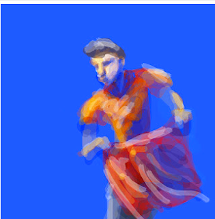
I really enjoyed today's life drawing class even though i thought i was going to die from the heat in the room. I feel i have made a step forward in my drawing, today something just clicked. Usually I go for a realistic approach, but that was because i thought that the more realistic a piece is the better it is. In today's session i decided to free myself up and draw how i would outside of the classes. I feel this has produced some interesting work that i want to pursue and develop.