Tuesday, 3 April 2012

Starting Points

I just wanted to go back and refer some earlier pieces of work that i have done that have qualities that i want to explore further. Here are some examples below.


(Experimentation with colour temperature)

(Tones formed from a strong light source. Model is a Mr Josh Prior!)

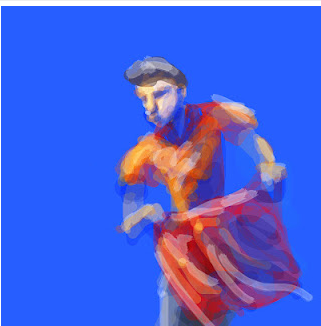
(An image created on the iPad is a life drawing session)

(Image created on the iPad. The subject was based on one of Aesop's fables of the Lion and the Mouse)


All these images have a common quality of a loose painting style. Tones are established quite abstractly and in a limited number. The top two images also evidence my experimentation with light and temperatures of tone, after our workshop focused on this i felt a little more confident with applying the techniques to my work outside of the drawing space.


Getting on with work

So I have to admit i have been neglecting this project so far with having put all my time and effort in to ILLUS 220 but now i have established a clear direction for what i want to explore for this module.

I want to increase my understanding of knowing how to distribute detail in paintings, knowing how much and how little to apply for the viewer to recognise what I Have drawn. Big influence on the decision for this project are the Illustrators Neil Ross and Ashley Wood. Both utilise digital and analogue tools and processes but there is a strong consistency to their work. Strong qualities of the work is big bold brush strokes and attention to using minimal detail where needed. In my experience of drawing, when i am taking a realistic approach i try and capture every detail possible, regardless of scale. Now i have learnt that this is not actually the best approach because in reality the eye never captures everything at the same time. To go in and draw everything exactly would be to draw to much information. The same consistency of detail throughout the depth of an image can cause it to flatten, a good example of where this technique is used purposely is in art with isometric perspectives.

Here are the links to the work of Neil Ross and Ashley Wood.

Neil Ross


Ashley Wood


Friday, 16 March 2012

Warm and cool tones

Threw this together as a quick practise focusing on light and shadow and the warmth and coolness of tones. painted using the track pad on my laptop, i like doing it now and again as it brings out some interesting shapes and frees me up from being bogged down in focusing on form too much, not that the form isn't important but this way just creates vibrant and more interesting marks. I stop now.


Pixelated forms

Was playing around with different brushes in photoshop to see what marks i could get them to produce. Some interesting results! This way of working may be worth exploring in my self initiated project. Lots more experimentation to do!


Sunday, 26 February 2012

In today's session we were working with the life model to produce illustration based on Aesops fable of the lion and the mouse. It was a little tricky to get into this at first as i was attempting to alter the figure of the model to that of a lion live in this session. I has never occurred to me before that you could draw reference from the human figure to build other forms, but from the experience of this session I did find it very helpful to draw a lion based of the structure of a human rather than draw a lion from memory.

Working on the iPad started a little slow and i have a few unsuccessful images but there appears to be a development in my drawing that gets better later on. I had approached the drawing in a number of ways but the most successful pieces are created when i draw out a underlying structure first as apposed to going straight in and building forms from colour.

I am still feeling a little constrained by the size of the iPads and at times they can be temperamental with low sensitivity.


Sunday, 5 February 2012

Artrage

Decided to experiment with an alternative to photoshop for digital painting. I used a programme called Artrage and my impressions of it so far are pretty good. Its great at creating natural looking brush textures and their is a good choice of tools and painting surfaces. Did this quick study this evening. Painted using the trackpad on my laptop, i find painting this way really brings out some interesting shapes and accidents.


Thursday, 2 February 2012

Life Drawing 02/02/12

I really enjoyed today's life drawing class even though i thought i was going to die from the heat in the room. I feel i have made a step forward in my drawing, today something just clicked. Usually I go for a realistic approach, but that was because i thought that the more realistic a piece is the better it is. In today's session i decided to free myself up and draw how i would outside of the classes. I feel this has produced some interesting work that i want to pursue and develop.