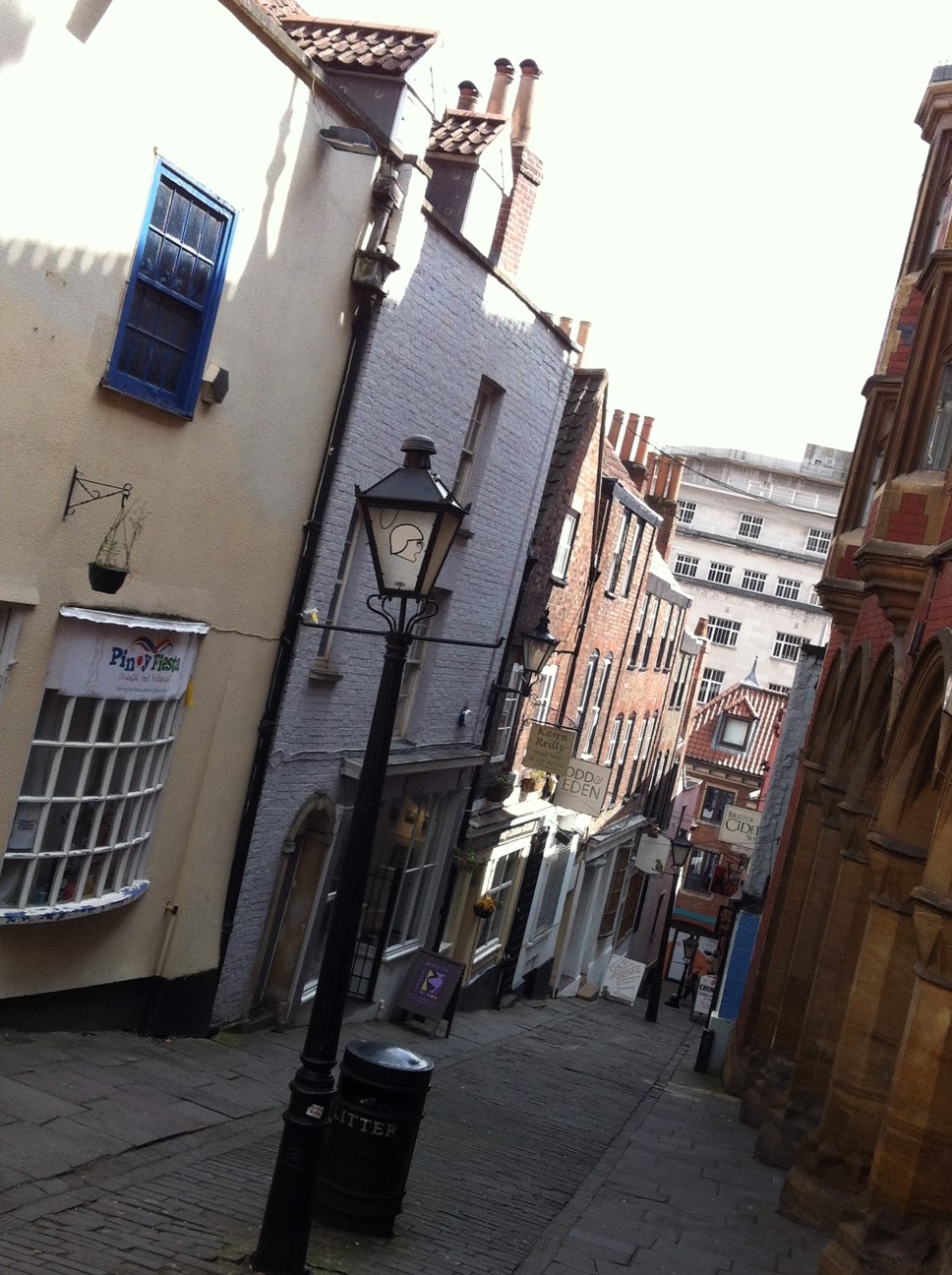
Went out today to get a bit more drawing done for the module. Thought i would have a go at doing artwork in both my sketchbook and on my iPhone to compare results and see what i could achieve. I decided to pick a location that offered a lot of depth and many levels within the depth of field. I started off by sketching trying to apply a variety of techniques to move elements back and forwards in the composition. The first technique was to pay more attention to detail to elements in the foreground as apposed to those behind. I found this wasn't very successful, at least in my drawing as i was using the same weight of line throughout the image, as a result the composition felt pretty flat.
[sketchbook pp. 7-8]
On the second try i used pencil and turned any big strictures in the background into simple shapes, removing any small detail. This seemed to give a better sense of scale when comparing the size of the people in the foreground to the buildings behind.
[sketchbook pp. 10]
Lastly I did another sketch but incorporated different line weights. Objects in the foreground were drawn with a heavier line, using a brush pen, and the opposite for objects in the background, drawn in biro. This worked better than the initial sketch but without the use of colour i am making the task much more difficult for myself.
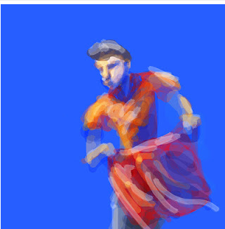
[sketchbook pp. 11-12] Unfortunately i did not have any colouring materials with me today so i decided to move onto painting on the iPhone.
Painting on the iPhone gave me the ability to introduce colour but it had its difficulties and disadvantages. The reflective screen makes it very hard to see what you are painting when in bright light, this really offsets the appearance of colours as well.
Drawing with the finger is good for forcing myself to avoid smaller, unnecessary details, but it is still takes a while to get the hang of. Even using a small line weight it is very tricky to get precision in painting as you can't see the point of contact between your finger and the screen, so it is not until you move your finger out the way that you can see the mark you have made. This meant there was a lot of trial and error involved with mark making. For any future painting i feel it would be necessary to use a stylus instead to give me more control in my mark making.