Saturday, 21 April 2012

Drawing in Bath

Went into Bath for the day to do some more drawing and to try out my new set of watercolour paints. There weather wasn't too good and there were heavy rain showers on and off all day so drawing outside was a little difficult. I managed to get one drawing kind of finished and the rain hitting the page caused all the colours to flow together, making the drawing seem wet. Started to go real loose on drawing objects in the distance, and began to remove the line. The cars in the background are just blobs of colour but the position in the composition should hopefully communicate what the marks are representing.


The paper i was using was not very absorbent but this gave me the ability to influence the paint for a long time after it was initially applied. The colours spread all over the page and the fibres of the paper has created a texture that looks like rain or mist.

Sunday, 15 April 2012

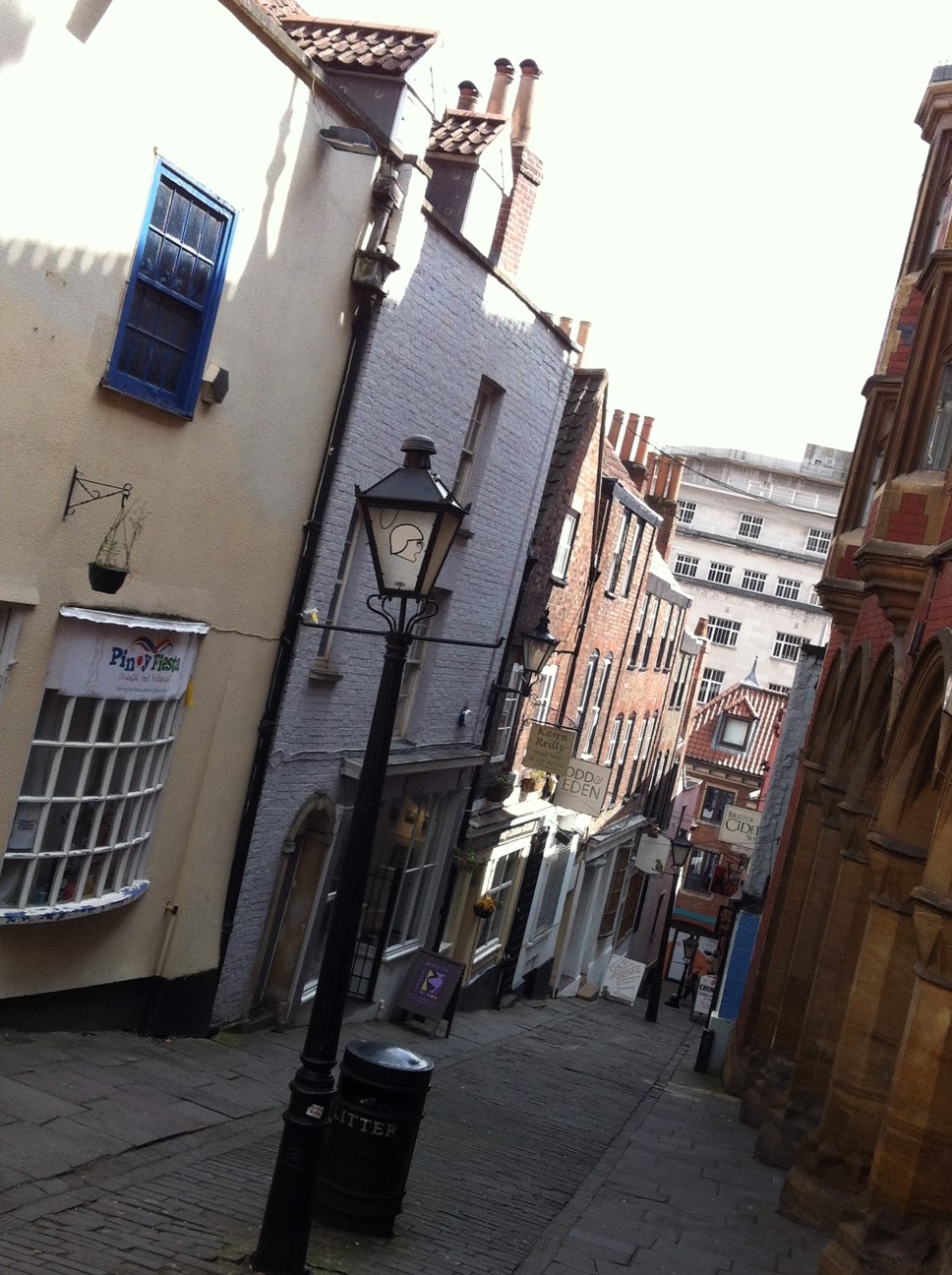
Christmas steps

This is another digital painting i did of the Christmas steps in Bristol. I decided to exaggerate the crookedness of the buildings to emphasise the the 'cramped buildings in the relatively small space.

I hit a barrier with this painting where at one point i thought i was creating utter rubbish, but i decided to carry on and i am now very pleased that i did. The early stages of a painting can be quite frustrating as it is so far from what you expect to see in front of you, but have patience and confidence in your own skills and it will improve. This is a problem that i had had for a while as i will tend to rush paintings towards the end. I still have a ways to go in developing the techniques i am using and applying them to a final image but with every painting i complete, and make sure to take my time over, it gives me the confidence to move on and develop.

I am beginning to see an interesting quality coming through these paintings that really excites me about the work i am doing. This art is completely artificial through the medium it is being created with but i seem to be capturing a sense of realism in my painting far more effectively than i have done in the past. I again have to make the point that i have made in previous posts that this development has come about through a better understanding of how to render the lighting in scenes.

In comparison to ILLUS 240 i know that i have not done as many drawings but the artwork in this module has been changed to a slower pace. I have more time to study stationary buildings, where as when drawing people, sketching was quick paced to capture movement and direction.


[Initial layout sketch on sketchbook pp. 25 - 26]

Saturday, 14 April 2012

Art Rage

Think i am going to give the 'Artrage' software another go and apply the new things i have learnt this time around. Will have a go at painting a few of the locations i visited.

Cafe Rouge

I thought i would brave doing another painting on the iPhone so this time i decided to do one indoors to try and avoid the difficulties of lighting that i experienced in the previous painting. I went into Cabot circus, sat down and looked for something to paint. I picked out the cafe 'Cafe Rouge'. Its red shop front and umbrellas stood out to me.


There was quite a lot to get into the small frame. it would have been very difficult to draw in each individual table and chair outside the cafe but from my perspective and the distance i was from the cafe they appeared as a single mass anyway so the quick, squiggly marks are sufficient to describe what they are. The same for the person in the bottom left corner. They are made up by blocks of colour but the contrast to the rest of the environment makes you see a figure.

This painting was much more successful than what i did a couple days earlier. Taking advantage of the zoom function in the Brushes app but then you don't get a clear picture of the whole frame. I do feel constrained to working on the small screen so moving to the size of an iPad is very tempting. If I compare my results between what i have done recently on my iPhone and what i did on the iPads in life drawing, i can see that the larger screen is much more efficient. I can achieve a more finished piece in the same amount of time.

Friday, 13 April 2012

Back Into Bristol

Went into town again today to do more sketching. Began the day by hanging out on Christmas steps to draw the narrow, steep lane full of crooked old buildings. Did a graphite sketch [Sketchbook pp. 17-18 ] to warm up and took a few photos to do some more drawing later.


Later that evening at home i decided to have a go at doing a digital painting using the reference i had. For this piece i wanted to focus on capturing the light and the variety of warmness and coolness of colours.


I kept my mark making loose and took time to decide what i wanted to add and remove in the composition. This was a 30 min painting so it is simplified but the majority of the work was put into correctly capturing the strong light on the tops of the buildings. I am still evaluating how minimal i can go with my mark making while retaining a sufficient amount of detail in forms for the audience to understand what they are looking at. For a rather short study i am very happy with how the painting turned out and even though i made the decision to simplify things down, there seems to be a sense of realism about the piece, which i believe comes through the correct depiction of the light in the scene.

The painting has atmosphere and the intensity of the light comes across well by over exposing objects like the chimneys and roof windows.

I have been continuing to educate myself on how to apply warmth and coolness to colours and this is really helping my understanding of lighting. For shadows, instead of using shades of black, i now use dark blues. I find this preserves the colour better and also it gives a sense of coolness to the shade. For highlights i now feel more comfortable with pushing colours to almost if not white to show the intensity of the light. I also overlay a wash of a warm tone of red or orange to depict the warmth coming from the light. I feel that i have used these new techniques successfully, if you compare the bottom of the buildings to the top you can compare the temperature of colours.

The temperature that comes through the paintings are the temperatures i experienced when i was physically out on location. It was rather cold sitting in the alley and sketching.

I plan to develop and apply these techniques to more refined paintings in the future.


Wednesday, 11 April 2012

Drawing in Bristol

Went out today to get a bit more drawing done for the module. Thought i would have a go at doing artwork in both my sketchbook and on my iPhone to compare results and see what i could achieve. I decided to pick a location that offered a lot of depth and many levels within the depth of field. I started off by sketching trying to apply a variety of techniques to move elements back and forwards in the composition. The first technique was to pay more attention to detail to elements in the foreground as apposed to those behind. I found this wasn't very successful, at least in my drawing as i was using the same weight of line throughout the image, as a result the composition felt pretty flat. [sketchbook pp. 7-8]

On the second try i used pencil and turned any big strictures in the background into simple shapes, removing any small detail. This seemed to give a better sense of scale when comparing the size of the people in the foreground to the buildings behind. [sketchbook pp. 10]

Lastly I did another sketch but incorporated different line weights. Objects in the foreground were drawn with a heavier line, using a brush pen, and the opposite for objects in the background, drawn in biro. This worked better than the initial sketch but without the use of colour i am making the task much more difficult for myself. [sketchbook pp. 11-12] Unfortunately i did not have any colouring materials with me today so i decided to move onto painting on the iPhone.


Painting on the iPhone gave me the ability to introduce colour but it had its difficulties and disadvantages. The reflective screen makes it very hard to see what you are painting when in bright light, this really offsets the appearance of colours as well.

Drawing with the finger is good for forcing myself to avoid smaller, unnecessary details, but it is still takes a while to get the hang of. Even using a small line weight it is very tricky to get precision in painting as you can't see the point of contact between your finger and the screen, so it is not until you move your finger out the way that you can see the mark you have made. This meant there was a lot of trial and error involved with mark making. For any future painting i feel it would be necessary to use a stylus instead to give me more control in my mark making.


Tuesday, 3 April 2012

OOOO i got an ideas!

Seeing as i will be looking at how to render forms at varying distances I'm obviously going to be paying a lot of attention to scale. If i draw something at a small scale and then blow it up much larger will it still communicate correctly and be readable as the same object?, and vice-versa if i draw something larger and shrink it down will it become to crowded and become just a miss mash of colours? It would be an exploration of how our eyes lie to us when we view our surroundings, at what point does what we recognise as an object from memory take over what we are actually viewing?